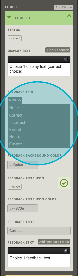
With the skin-selector set to “None”, the feedback response will not have any changes applied. It will display as-defined by the given assessment result.
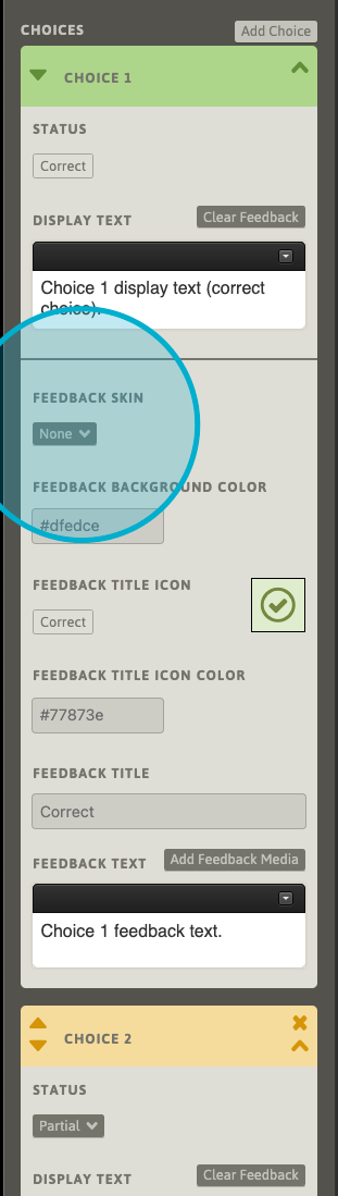
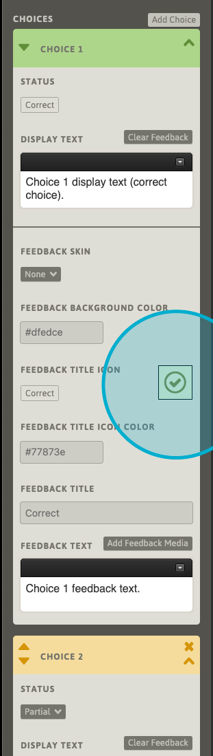
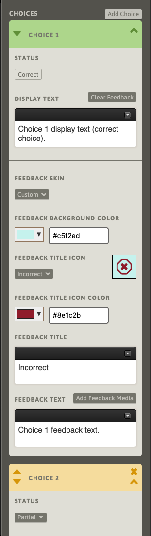
The fields below the skin-selector provide more details about the background color, icon/color, title color and title text that will be displayed in the feedback response.
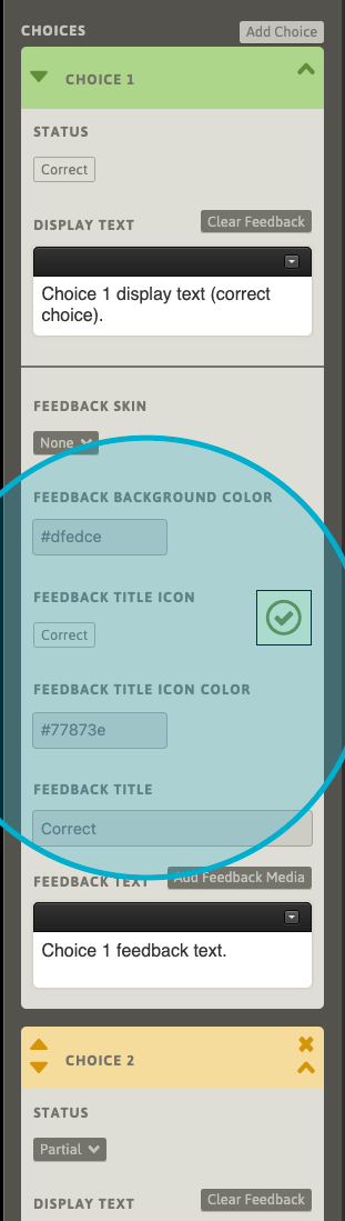
A preview box displays the combination of the resulting icon, its color, and the background color as they will be displayed in the learner-facing feedback response.
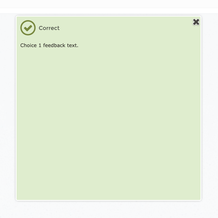
Changing the skin-selector to one of the other common feedback responses will update the fields with the parameters of the currently-selected skin. For Correct, Incorrect, Partial and Neutral skins, these fields will remain read-only and are not editable.
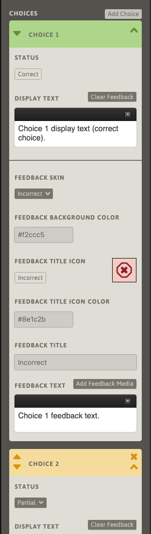
Here, we’ve assigned an Incorrect skin to a Correct result.
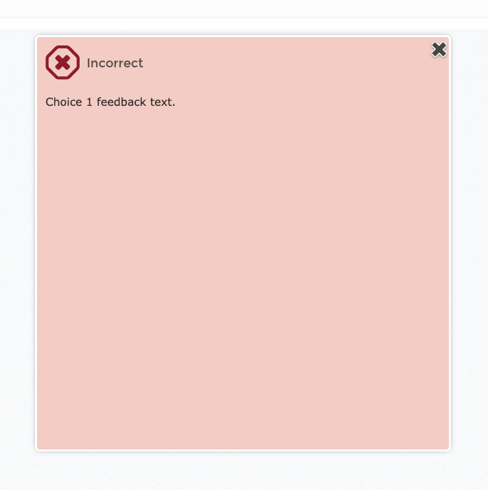
Save the Path and check the results in the Previewer.
Changing the skin-selector to “Custom”, the skin-configuration fields will become editable, allowing a bespoke configuration for the feedback response. Note that the fields will attempt to “take up” their respective, most-recent values upon becoming editable.
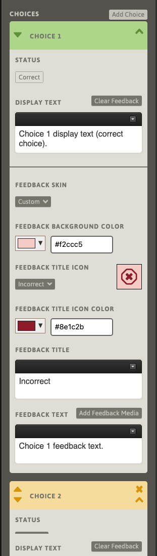
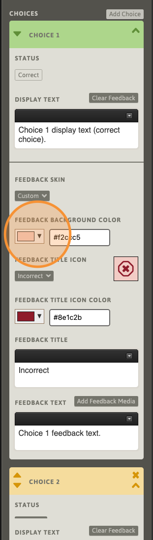
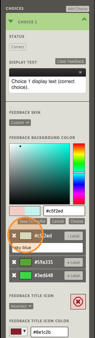
To assign a custom background color to the feedback popup, use the color-selector box to the left of the hex-value color field. A hex-value color can also be entered directly into the field.
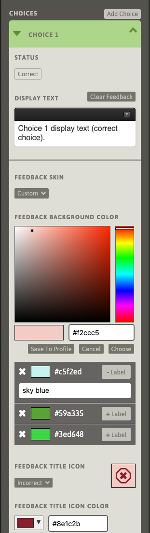
While the color-selection tools are open, a list of saved colors will be available below the color-selection palette section. Saving colors is an optional convenience, and is not required for selecting custom colors. If no colors have been saved, the list will be empty. We will return to color-saving shortly.
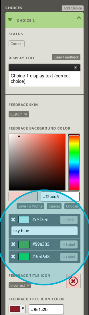
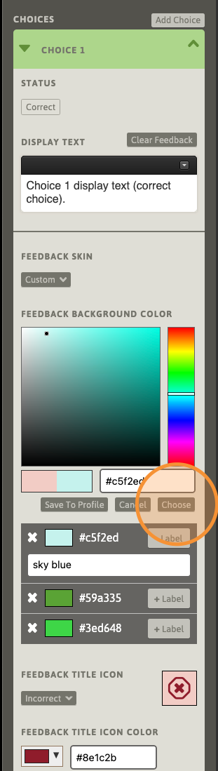
To select a saved color, click its corresponding color-box.
After selecting a color, use the “Choose” button to apply the currently-selected color to the field. The color-selection tools will close and the feedback display parameter fields and preview will update.
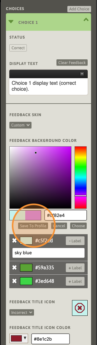
While the color-selection tools are open, any selected color can be added to the author account. Saved colors can be recalled and applied to any feedback response in any Path in the current author’s account. Here, we’ve selected a shade of purple. Use the “Save to Profile” button to immediately add this color to the current author account (saving the Path is not required). To instantly remove a saved color from the account, use the corresponding X button. Note that removing a saved color from the list will not affect any applied instances of this color.
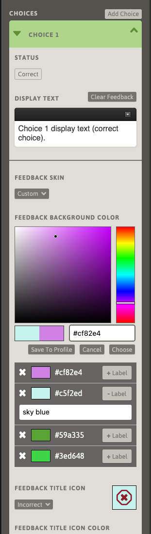
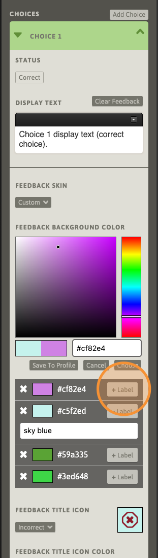
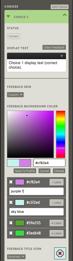
Optionally, a reference label can be applied to any saved colors in the list. Use the “+ Label” button to add a field for adding a label. Use “- Label” to remove the corresponding label. Like saving the color to the author’s profile, adding, editing, or removing a color’s label is instantly saved to the account without having to save the Path.
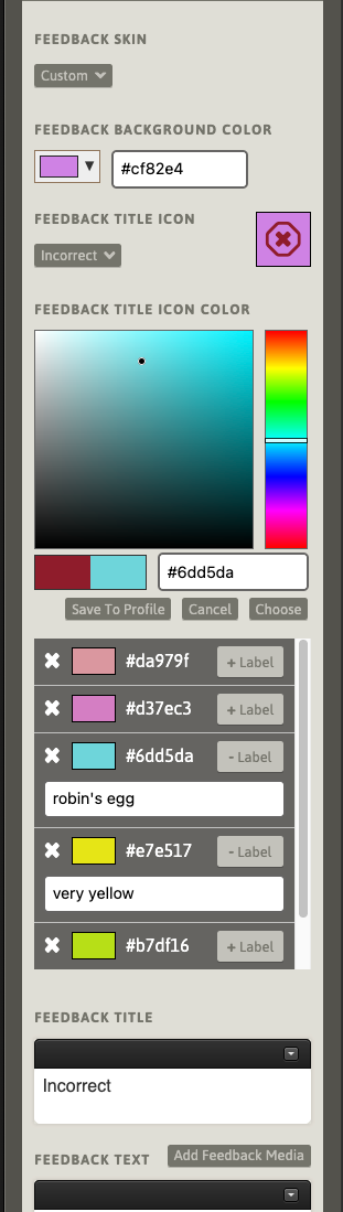
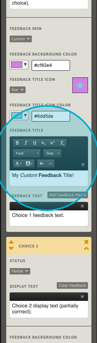
There is an identical color control set for the Feedback Title Icon. Here, we will set the Feedback Title Icon color to a light blue.
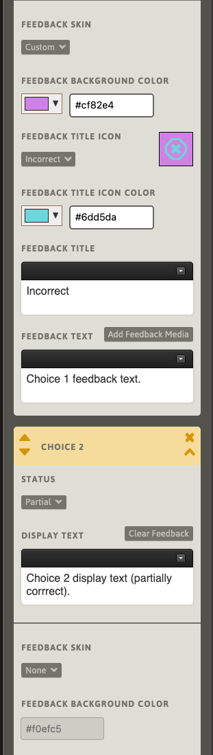
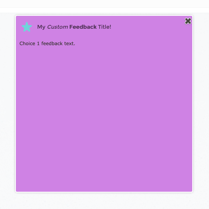
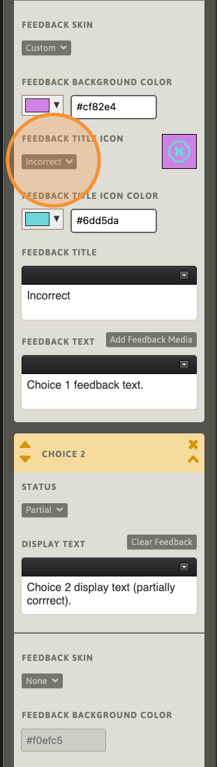
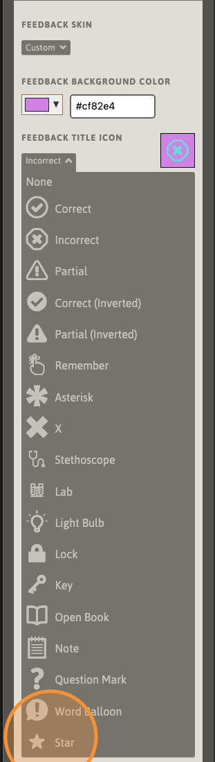
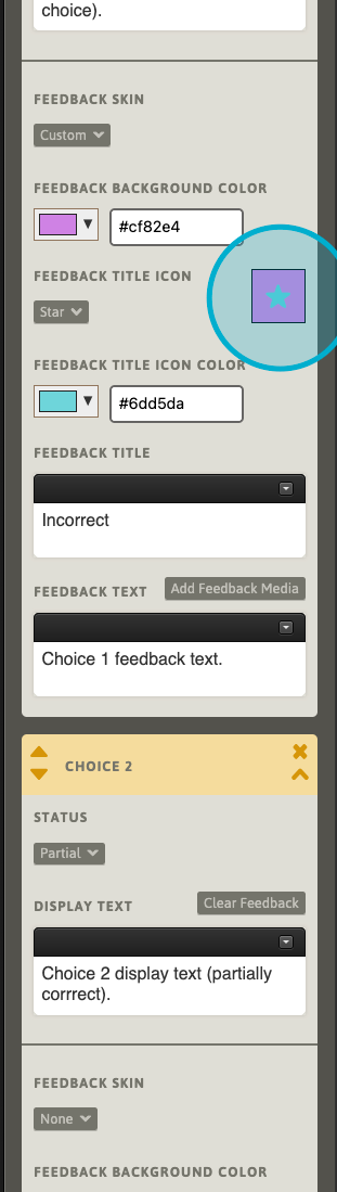
Next, we will change the Feedback Title Icon. Use the icon selector, and select an icon from the list that appears. Note that the labels are only suggestions for usage, not definitions of specific purpose. Here, we’ll select the “Star” icon. To configure the feedback result without an icon, select “None” from the list.
The contextual preview will update with the currently-selected icon.
Next, we will set a custom Feedback Title, including some rich text styled elements. To configure the feedback result without a title, clear this field.
Save the Path and check the results in the Previewer.