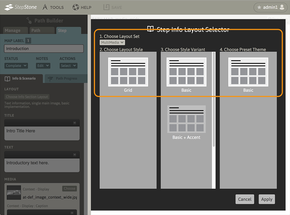
To swap to the Media Grid layout type, navigate to the Info & Scenario tab and click the “Choose Info Section Layout” button to launch the Step Info Layout Selector overlay panel. In section 1, select “MultiMedia”. In section 2, select “Grid”. Section 3 allows selecting the “Basic” variant or the “Basic + Accent” variant. Click “Apply” to confirm your selections.
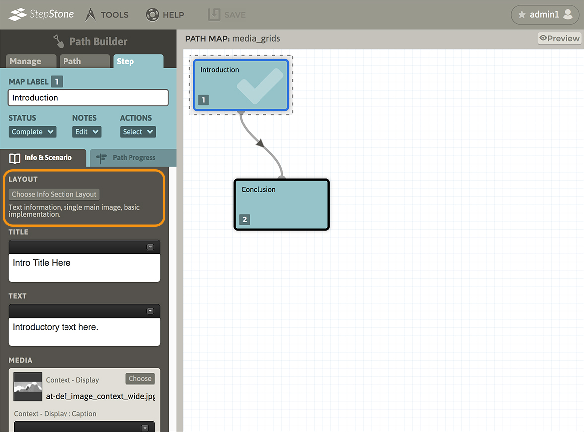
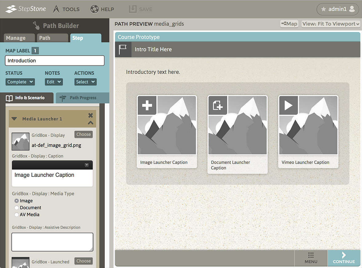
After swapping to the Media Grid layout, the editor panel will display the new layout type, and the author is presented with input fields for the step Title and main Text, a Media stack, and a Clipboard stack section.
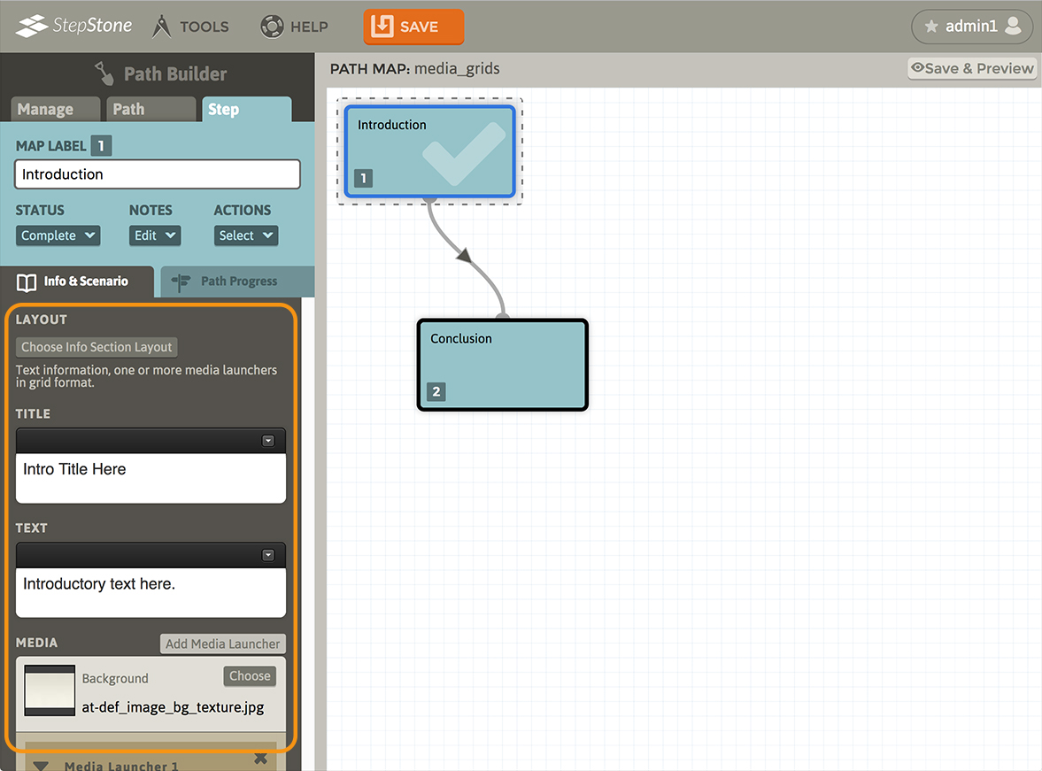
A single Media Launcher “block” will be present below the background media item.
Use the “Add Media Launcher” button to add additional Media Launcher blocks to the bottom of the stack.
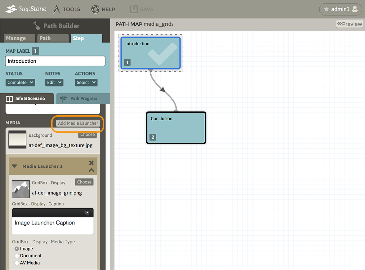
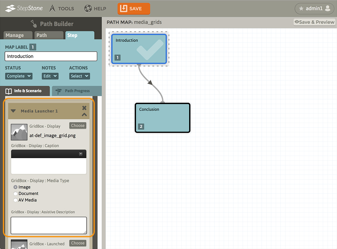
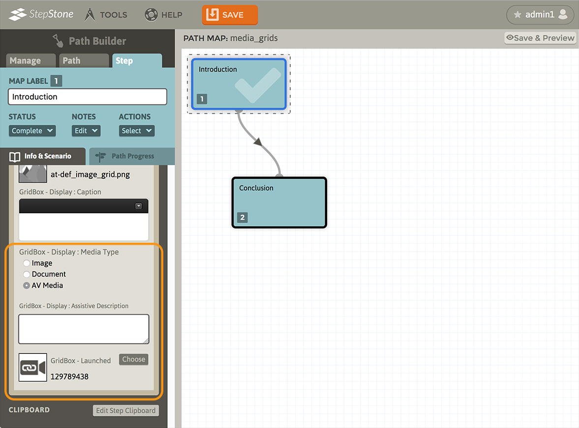
Each Media Launcher block contains the following elements :
- GridBox – Display. This allows selecting the launcher image that appears in the grid stack.
- GridBox – Display : Caption. This provides an optional rich-text caption field that will display below the respective grid block.
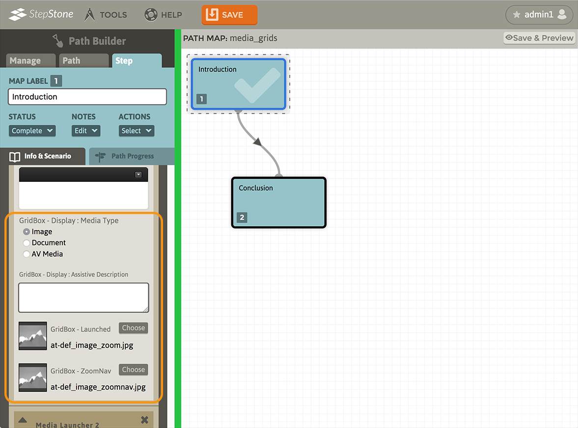
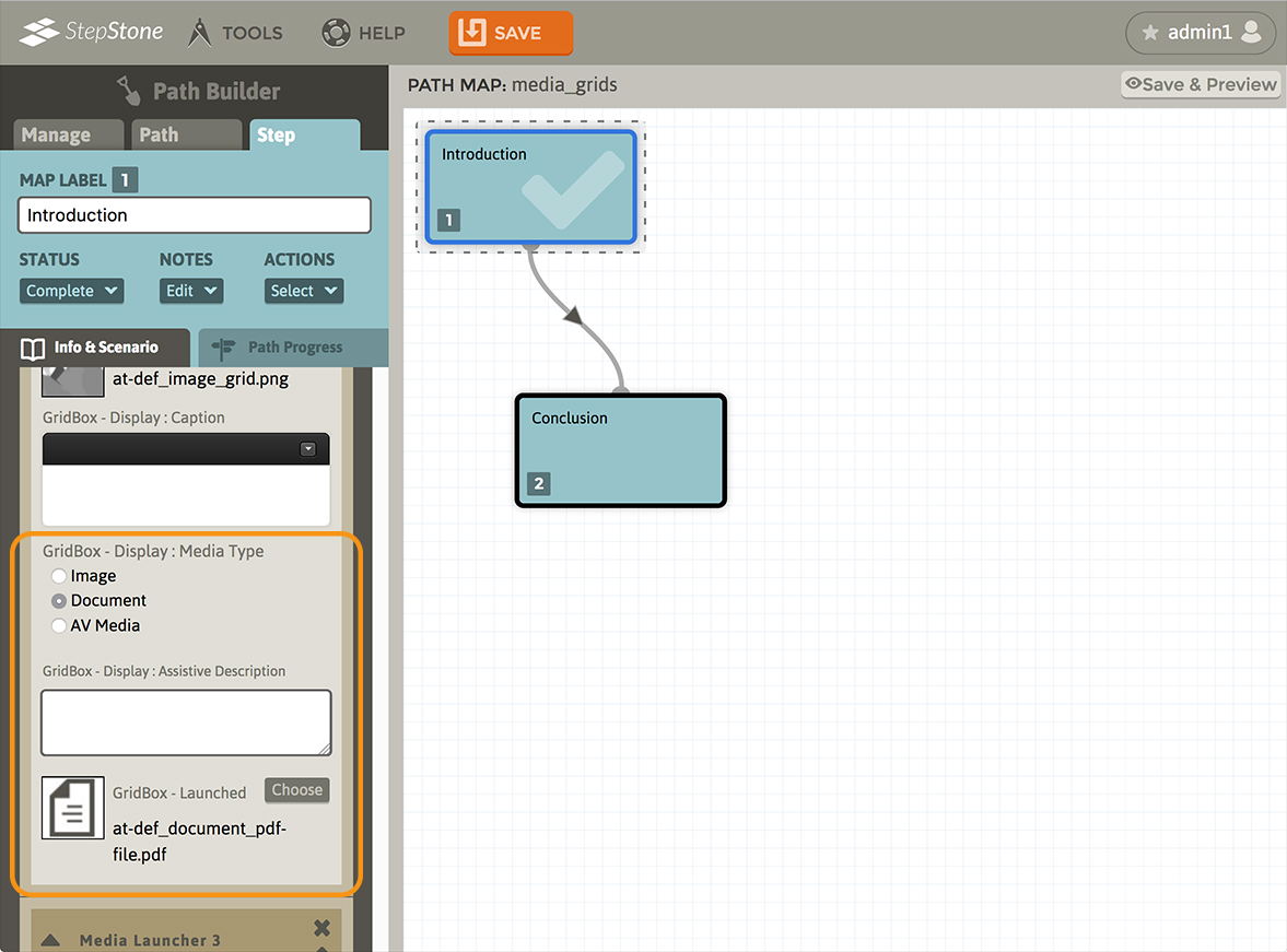
- GridBox – Display : Media Type. This allows swapping the media format of the launched media. Available options are Image, Document, and AV Media.
- GridBox – Display : Assistive Description. This provides a plain-text field that allows the author to provide additional descriptive language for the purpose of screen-readers.
Elements unique to the different media types are as follows :
Image grid launchers provide a “GridBox – Launched” element (for the full-sized image that displays in the launched image viewer popup) and a “GridBox – ZoomNav” element (for the “nav-map” image that appears in the upper right of the media viewer popup.)
Document grid launchers provide a “GridBox – Launched” element (for the pdf file that displays in the launched media viewer popup.)
AV Media grid launchers provide a “GridBox – Launched” element (for the video stream that displays in the launched media viewer popup.)
Below the Media stack, a Clipboard section allows authors to apply one or more Clipboard groups to the step. Please review the Clipboard tutorial for more information regarding building Clipboard groups.

The result of the Media Grid layout type looks like the following in the Player :