as well as a Grid type:
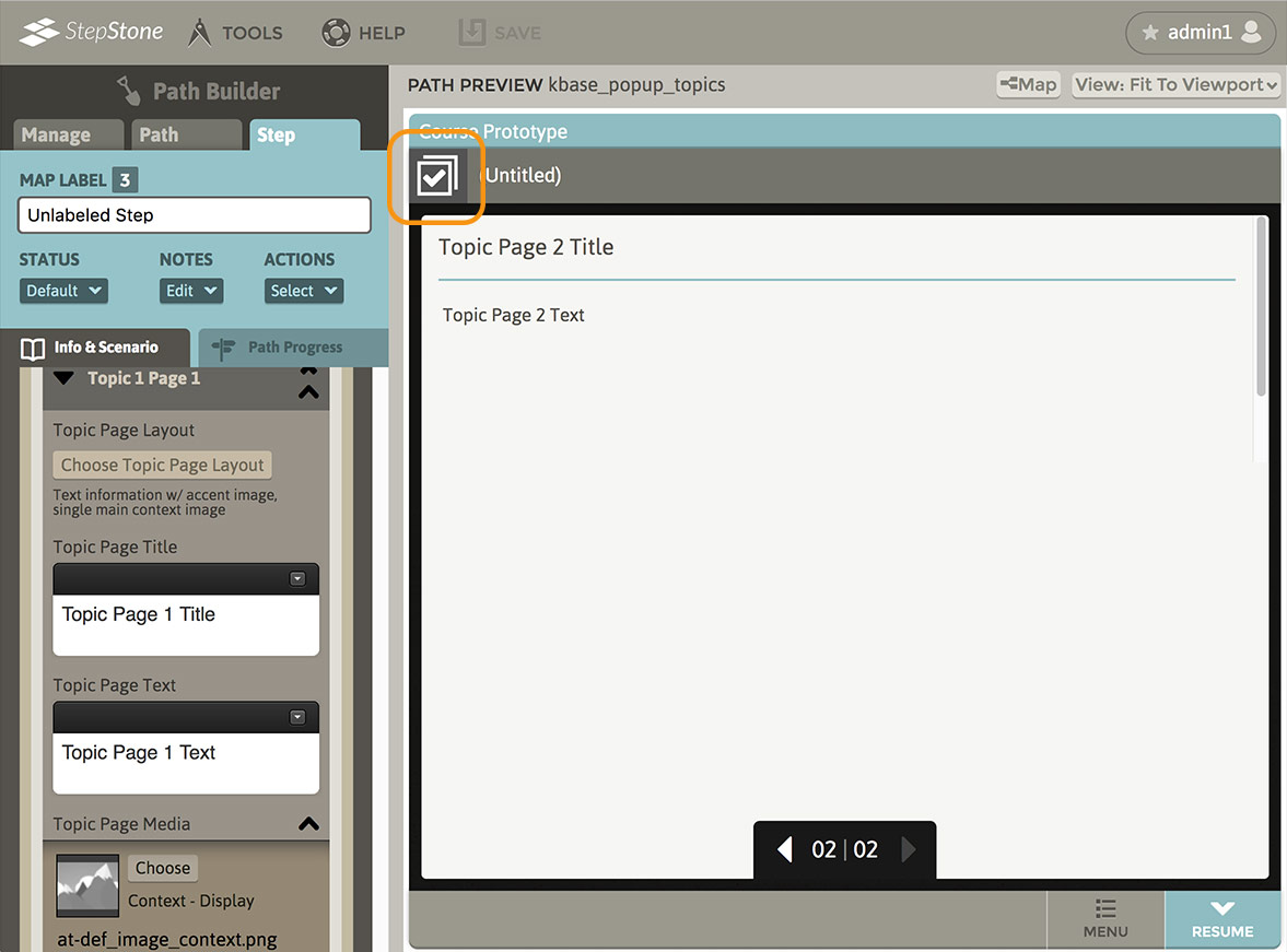
Both Popup Topic types present the learner with one or more launching “buttons” that open a sub-narrative in an overlay panel on top of the main content area. This Popup Topic sub-narrative can have one or more of its own informational “pages” of content, using the same Info layout options as the main Info area (exceptions are detailed later in this article.) There are Forward and Back buttons available to navigate the currently-launched Popup Topic, and at any time, the learner can use the “Resume” button in the lower right corner to dismiss the launched Popup Topic and return to navigating the main content area.
If a learner exits a Popup Topic, and later (without exiting the main step) re-launches that Popup Topic, the most recently viewed Topic Page will be “resumed”. If a learner views every page in a launched Popup Topic sequence (even if exiting and returning to the same Popup Topic sequence without exiting the main step), the upper-left “active” content indicator icon changes from a “Popup Topic sub-narrative” symbol to a “completed” notification. The same change is applied to the media indicator icon for that Popup Topic launcher on the main content area. This applies to both Singular and Grid types. The view-status progress of the Popup Topics on a step is not tracked or stored after the learner leaves the main-level step.
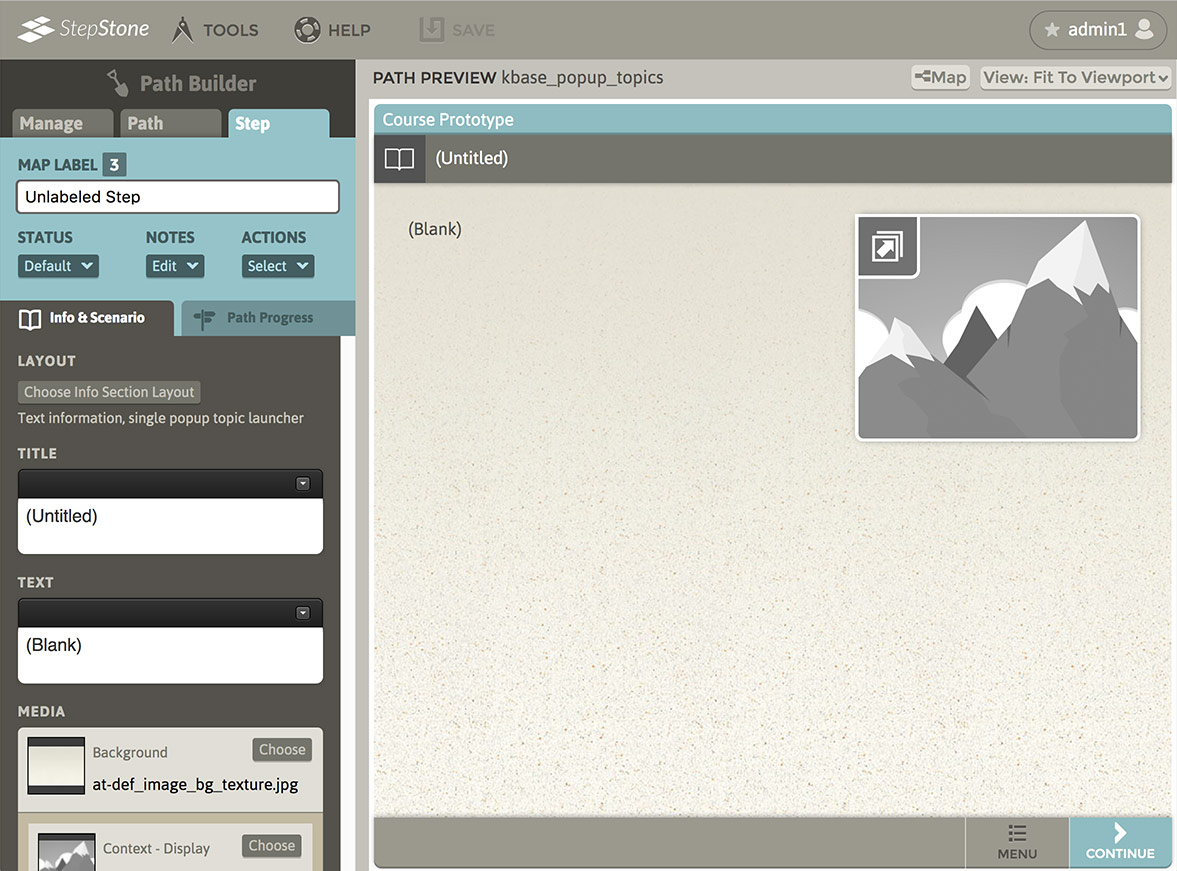
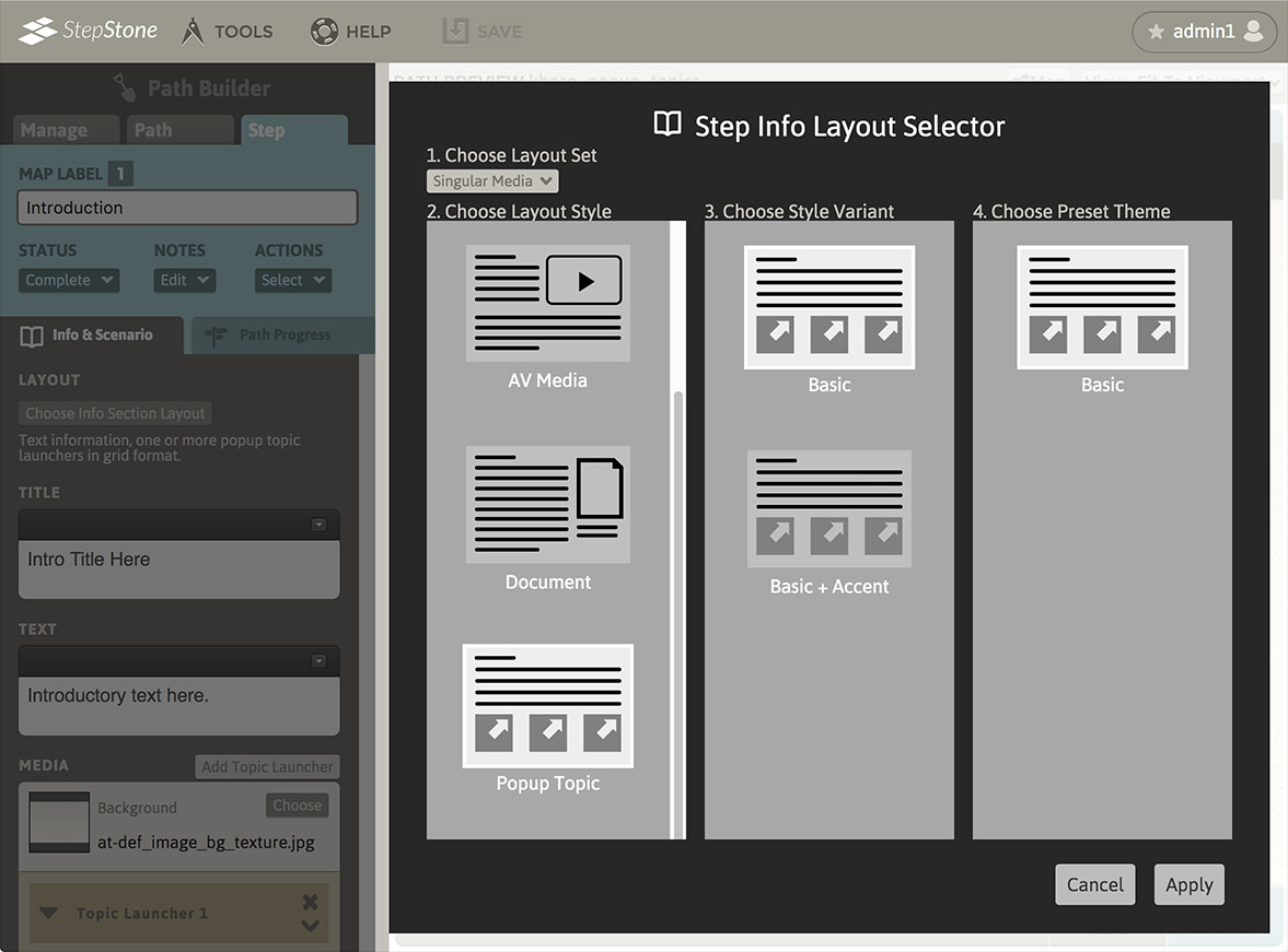
To swap to the Popup Topic (Singular) layout type, navigate to the “Info & Scenario“ tab and click the “Choose Info Section Layout” button to launch the Step Info Layout Selector overlay panel. In section 1, select “Singular Media”. In section 2, select “Popup Topic“. Section 3 allows selecting the “Basic” variant or the “Basic + Accent” variant. Click “Apply” to confirm your selections.
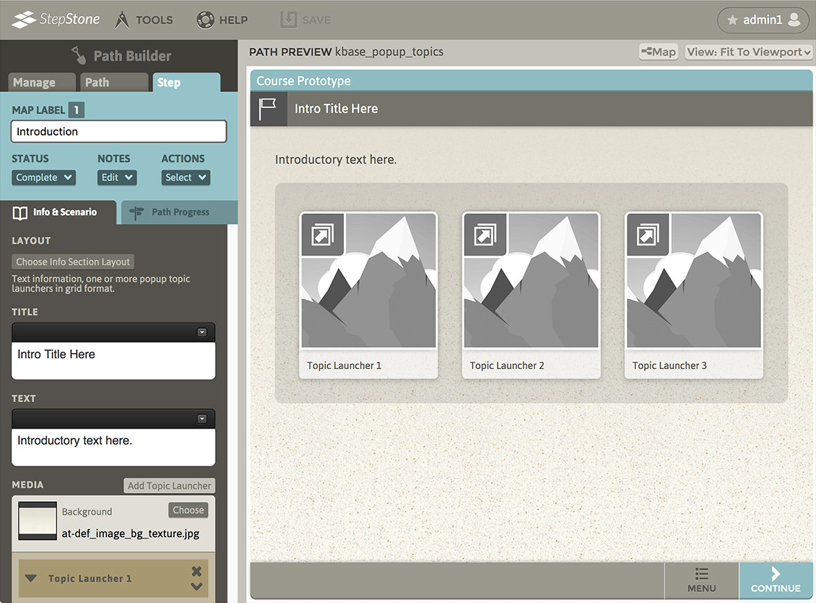
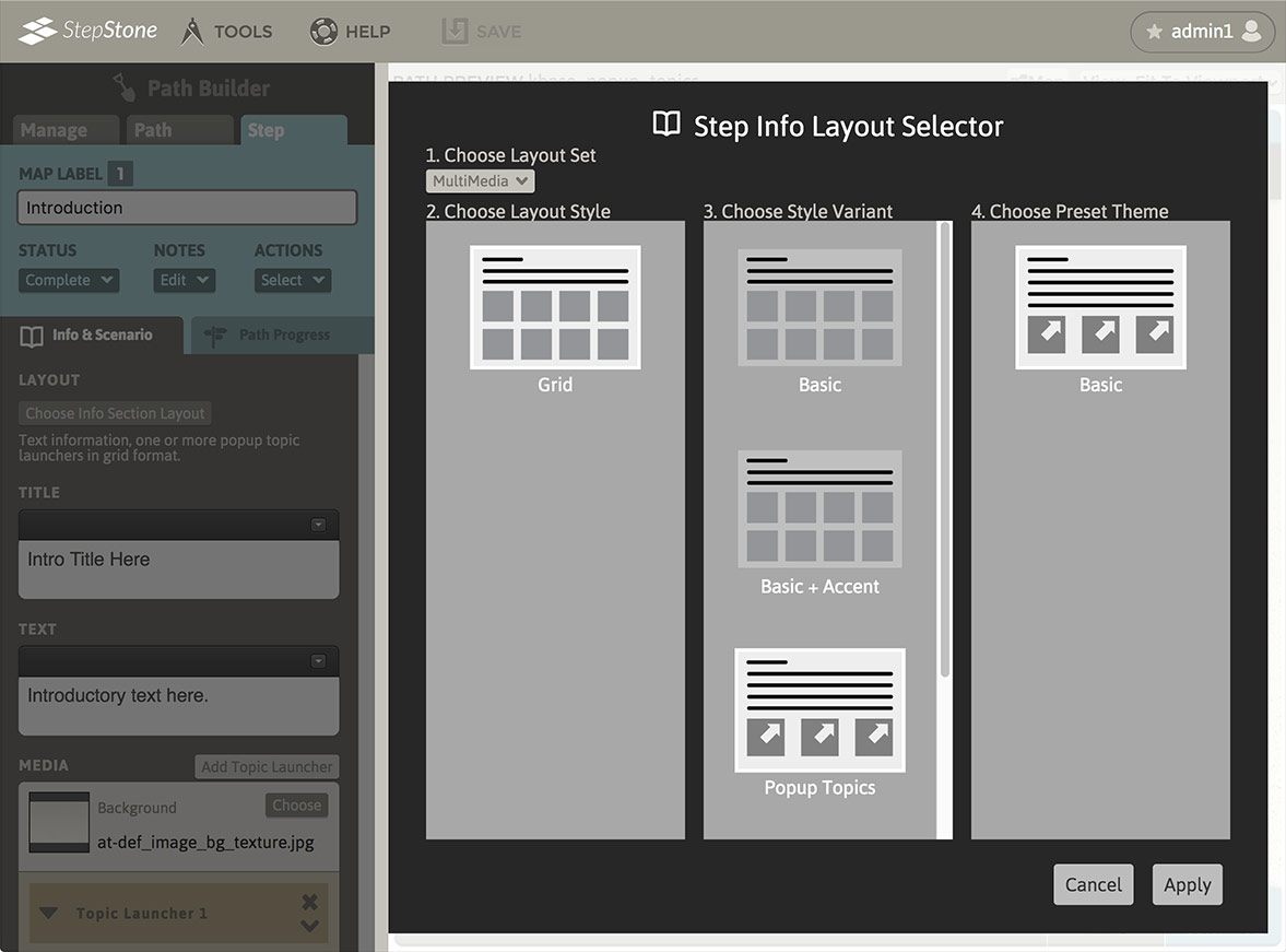
To swap to the Popup Topics (Grid) layout type, navigate to the Info & Scenario tab and click the “Choose Info Section Layout” button to launch the Step Info Layout Selector overlay panel. In section 1, select “MultiMedia”. In section 2, select “Grid”. Section 3 allows selecting the “Popup Topics” variant or the “Popup Topics + Accent” variant. Click “Apply” to confirm your selections.
After swapping to either type of Popup Topic layout, the editor panel will display the new layout type, and the author is presented with input fields for the step Title and main Text, a Media stack that includes the Popup Topic launcher edit sub-panels, and a Clipboard stack section.
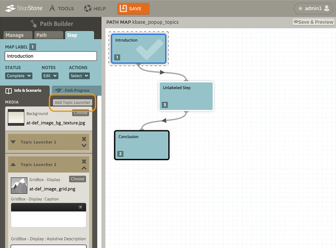
The Popup Topics (Grid) layout also provides an “Add Topic Launcher” button at the top of the Step Info Media stack, which is used for creating additional Popup Topic launcher sets. Each added Popup Topic set is appended after the last existing Popup Topic launcher set.
Editing Popup Topics
Each new Popup Topic launcher set includes:
- A media slot for assigning the launcher button thumbnail image.
- An optional launcher caption field.
- An optional assistive description field.
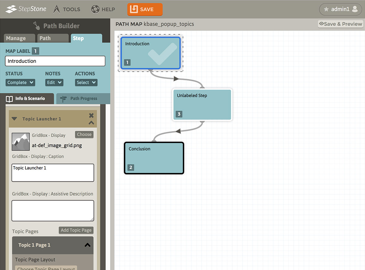
- A “Topic Pages” section
The Topic Pages section for each Popup Topic is organized into a stack of one or more Informational content blocks. Each Topic Page can utilize any of the layouts available to the main page Info section, and is engaged by the learner in a manner similar to the main content area. The differences are:
- To help underscore the launched Popup Topic “mode” to the learner, Popup Topic pages are set on a plain white background. No background images are permitted.
- Popup Topic pages cannot nest Popup Topics within themselves.
- Popup Topic pages are informational only, and do not permit Step Assessments like the main content area.
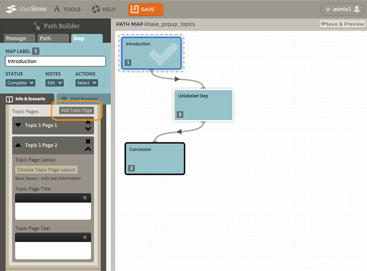
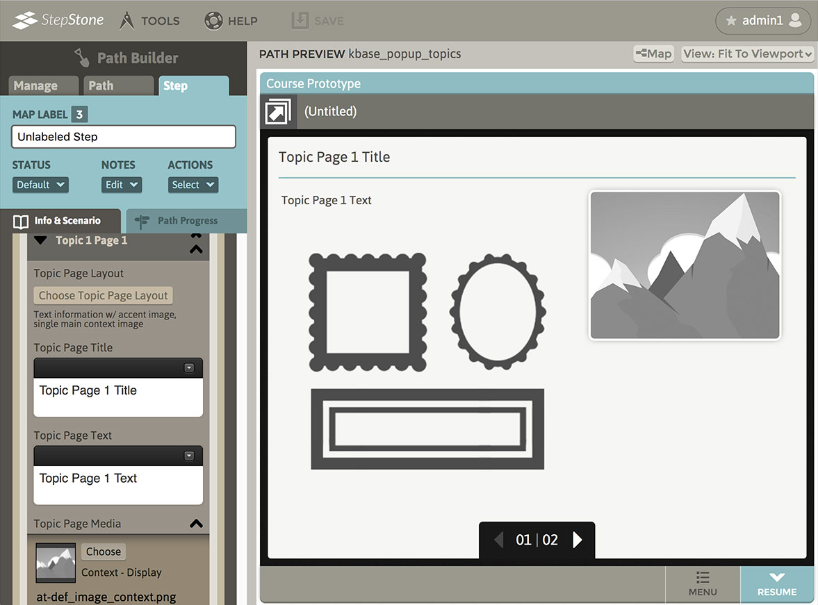
All Popup Topics must include at least one Page. If two or more Pages exist in a Topic, up/down arrows are placed on the left side of each Page to adjust the sequential order of the Topic’s Pages, and X buttons are placed on the right side to delete the pertinent Topic Page. The text-only Basic layout is the default for all new Popup Topic pages. Like all Popup Topic Page layouts, fields are provided for entering the Topic Page title and text.
Use the “Choose Topic Page Layout” button at the top of each Topic Page block to open the layout selection panel and change the Topic Page content layout. Topic Page layouts that have media elements will apply a “Topic Page Media” section to the swapped Topic Page editor panel. This is handled exactly like the media stack for the main content area, except there are no Background media slots. Respective to the selected Topic Page layout, media types such as Singular, display-only images, launchable single images/documents/videos, and launchable media grids are available for Topic Pages.
If applying a multi-element Media Grid to a Topic Page:
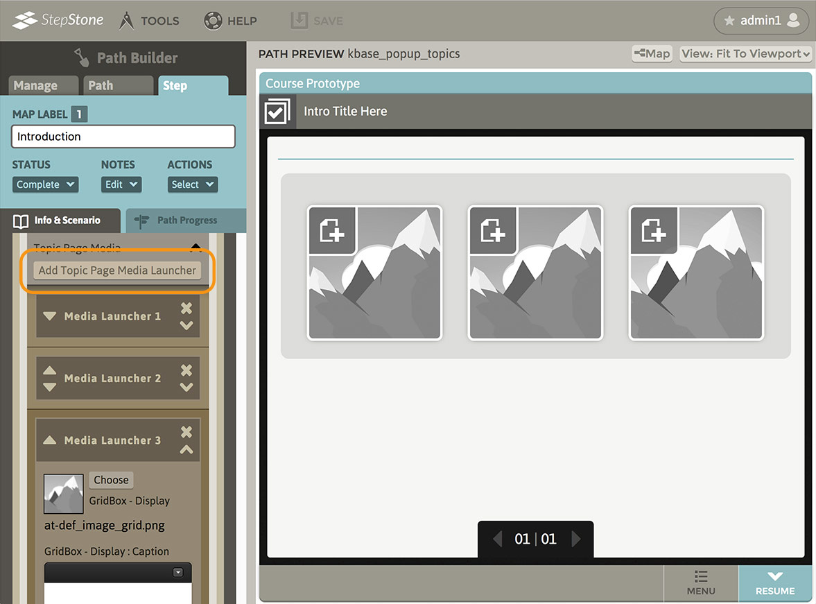
- Use the “Add Topic Page Media Launcher” button to add a new Media Launcher group after the last existing Media Launcher in the respective Topic Page media stack.
- The ordering of the individual Grid launcher blocks is adjustable via the up/down arrows on the left side of the media slot, just like a Media Grid on the main content area. Arrows appear contextually, depending on the slot order and quantity.
- The X button on the right side of each media slot will delete the slot from the pertinent Topic Page media stack. There must be at least one media slot in a grid, so there will be no X button if only one media grid block exists.