Choosing Layouts and image types
The
Layout Selector (found under the
Info and Scenario tab in the
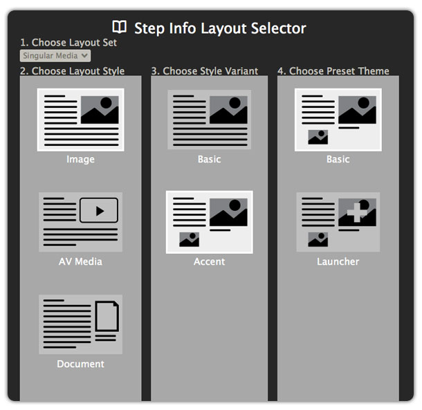
Step panel) allows you to choose from various pre-built templates. Those containing image elements are found under 1.) Layout Set:
Singular Media > 2.) Layout Style:
Image > 3.) Style Variants:
Basic and
Accent.
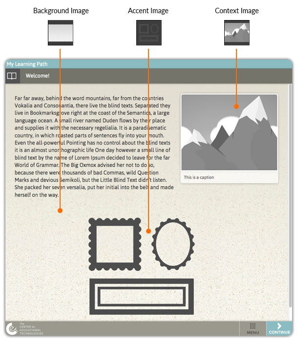
Selecting the
Basic Style Variant places a contextual image placeholder in the upper right of the screen. Selecting the
Accent Style Variant places a contextual image placeholder in the upper right of the screen and a secondary image below the text area.
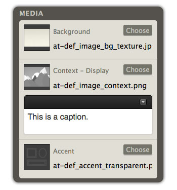
Once a layout is selected and applied, return to the
Media heading under the
Info and Scenario tab. Now you can replace the placeholder images with your own images.
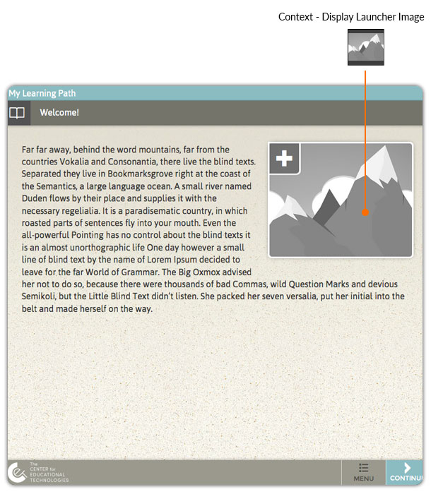
Using image Launchers for large, zoomable images
Selecting the
Basic Style Variant and
Launcher Preset Theme places a thumbnail image placeholder in the upper right of the screen.
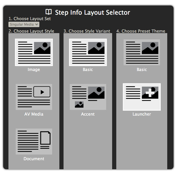
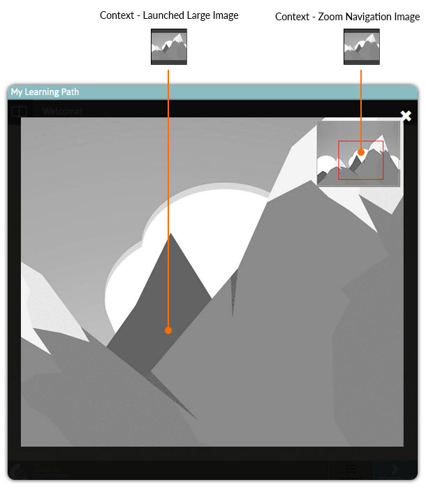
This thumbnail is a small version of a very large image. When the learner clicks the thumbnail, it launches the large version in a lightbox view that can then be zoomed in for detailed viewing.
For this option you’ll need to provide three sizes of the image:
- Display Launcher (300 – 700 px wide)
- Large zoomable image (1000 – 2000 px wide)
- Zoom navigation image (150 px wide X 120 px tall)
Basic Image Requirements
The following image formats can be used: .jpg, .png, .gif, .svg
Images should be in RGB color mode and at a screen resolution of 72 dpi.
Keep the file size of images in mind when building your learning paths. Large files will take longer to load and detract from the learning experience.
For more detailed information about working with images, visit the
Author Academy Media Guide.
